scroll down
Client
Soap Box
Agency
(Personal Project)
Year
2016
The idea behind this newly established brand was to create a simple concept that was recognisable and friendly. The initial process was to come up with a logo that went against the stereotypical and standardized elements that are seen within the designs of the laundry industry.
The idea behind the logo was to create a simple and memorable design. This led to the name ‘Soap Box’ written within shapes, reminiscent of a washing machine. After the logo was developed, the overall concept of the brand flourished from there, including what message it would bring to its customers. This message was comforting and trustworthy. A pattern was created with vibrant friendly colours in the style of intertwining knitted threads. This design would become the familiar image that Soap Box’s customers would come to recongise and rely on.
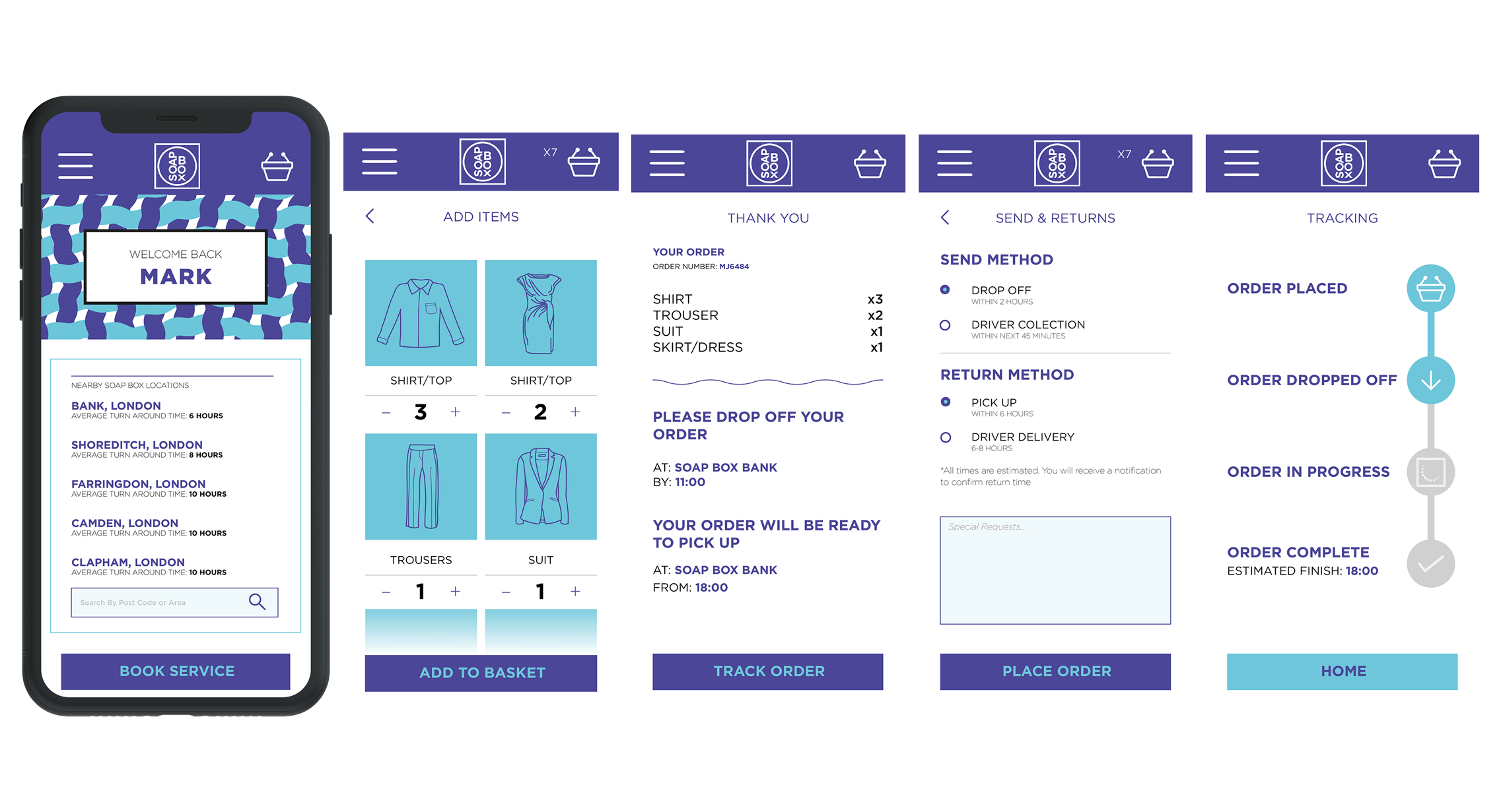
To move this project forward, I planned and created an initial strategy by prioritising the content and visualising an engaging way which app users could book their laundry for a service at a Soap Box location. This helped me to better articulate my design decisions in the process and translate conceptual thinking into a viable proposal.