scroll down
Client
Just
Agency
Pink Squid
Year
2020
Art-Director
Charles Grenu
Copywriter
Xuan Hoang
Developer
Virtual Forge
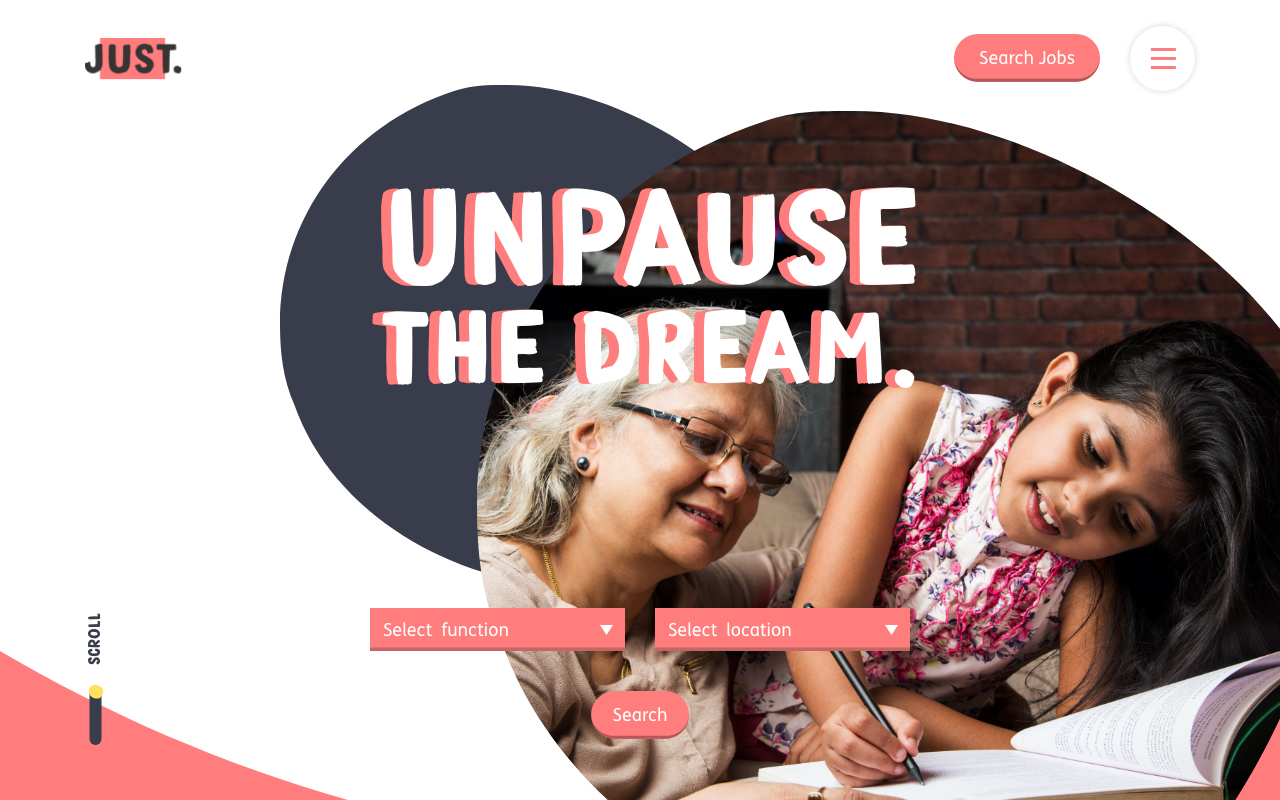
Just is a brand that doesn’t want to follow typical corporate styles, as seen with many others within the finance industry. They want their brand to be fun and engaging, both to their customers and to their employees. This gave me and my team of an Art-Director, Copywriter and motion Creative the license to be quite fun and playful with the design of the careers website.


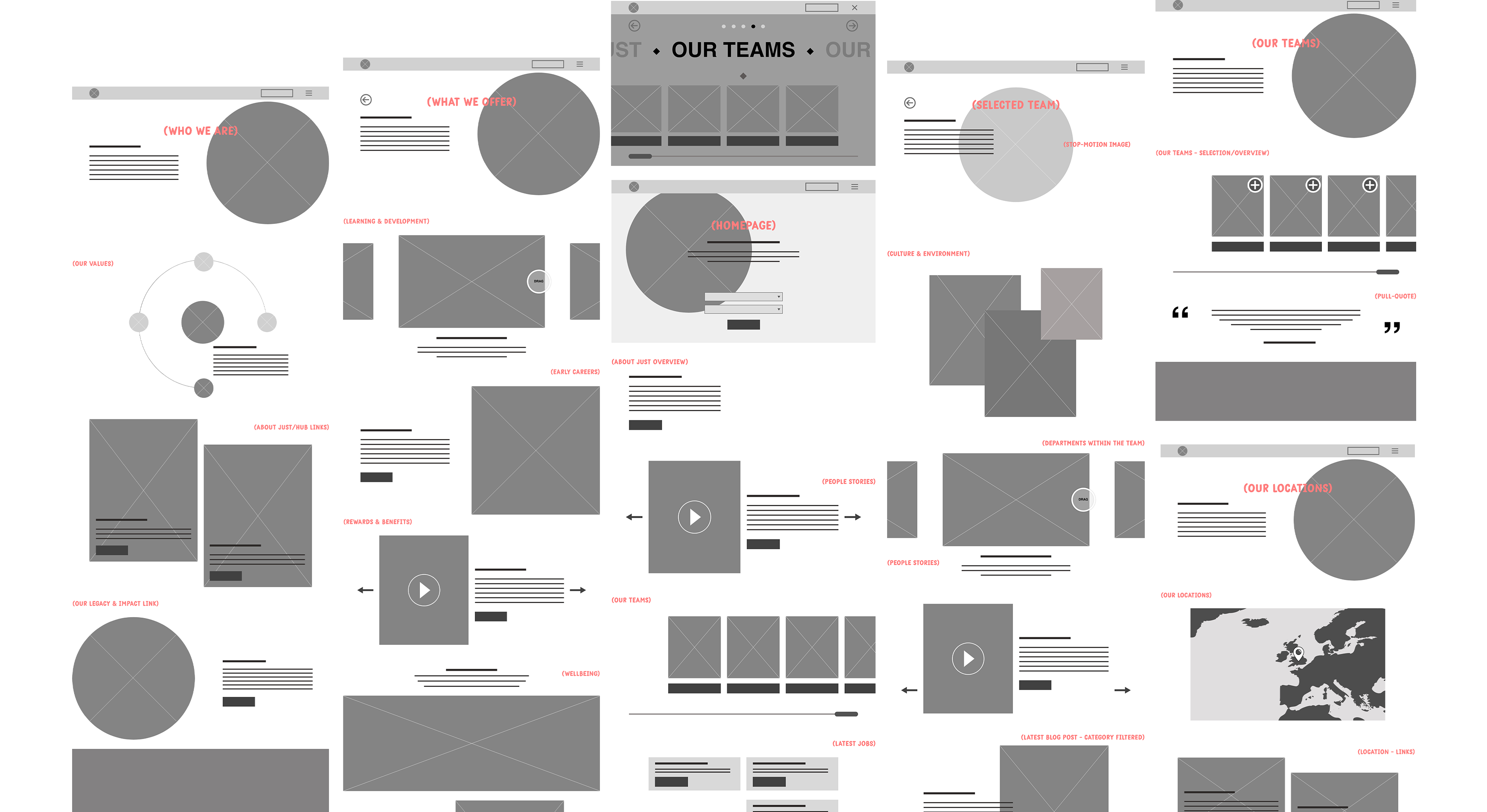
The architecture of the site needed to be simple, doing without heavy content or unnecessary pages. Content positioning helped influenced the users, with suggested pages on the website to visit. To go with Just’s fun and engaging personality, the navigation was something that needed to go against the traditional styles. A pop-out menu with horizontal-scrolling, showcased different topics of pages in a more fun and engaging way.

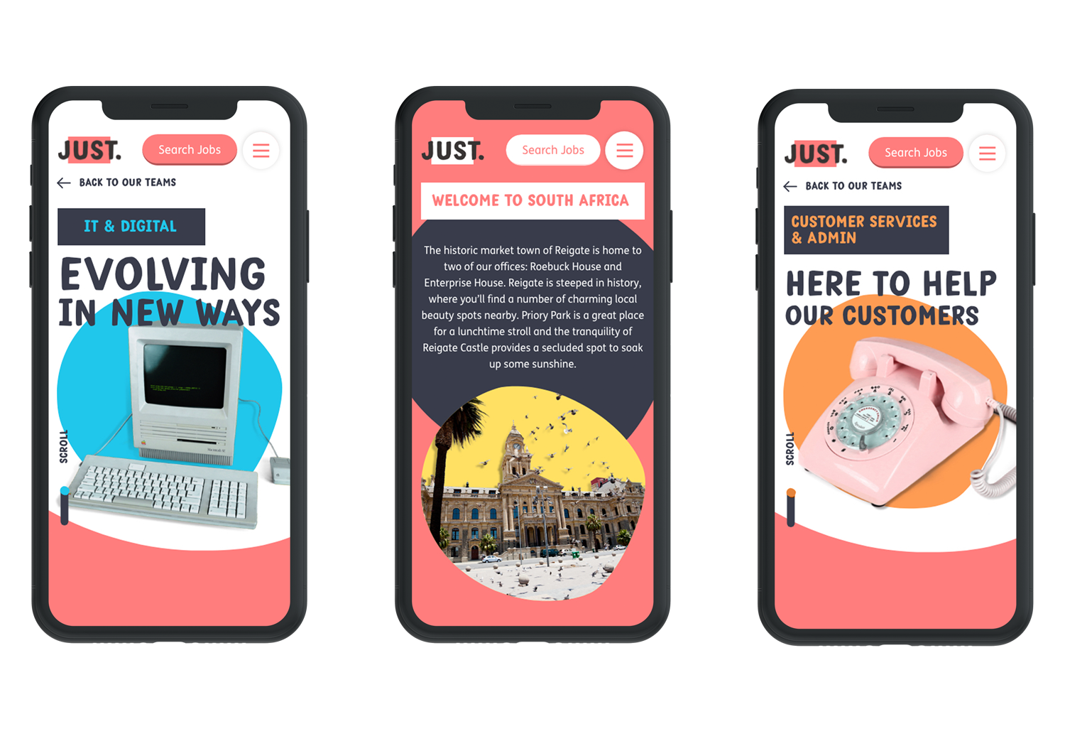
The careers website needed to showcase its fun and personality across the board. For each of the team pages, we wanted to have something that represented the personalities of the department, whilst also keeping the Just playful style. For each team, we bought a retro object that represented them, and shot each of them moving in stop-motion. This would be the makeup of the headers for each of the team pages. As user’s scrolled down, the stop-motion animation would play with relevant body copy accompanying the animation. We have plans to have members from each team do photoshoots with the object, just to make them even more purpose.
Outcome
The Just careers website, is in its early stages of its lifecycle and it still does need a lot of further development in terms of functionality and bug fixes. The design of the site received positive feedback for all inside Just for its playful style and engaging navigation.


